Compare a Dark Kitchen Wall With the Light Already Available
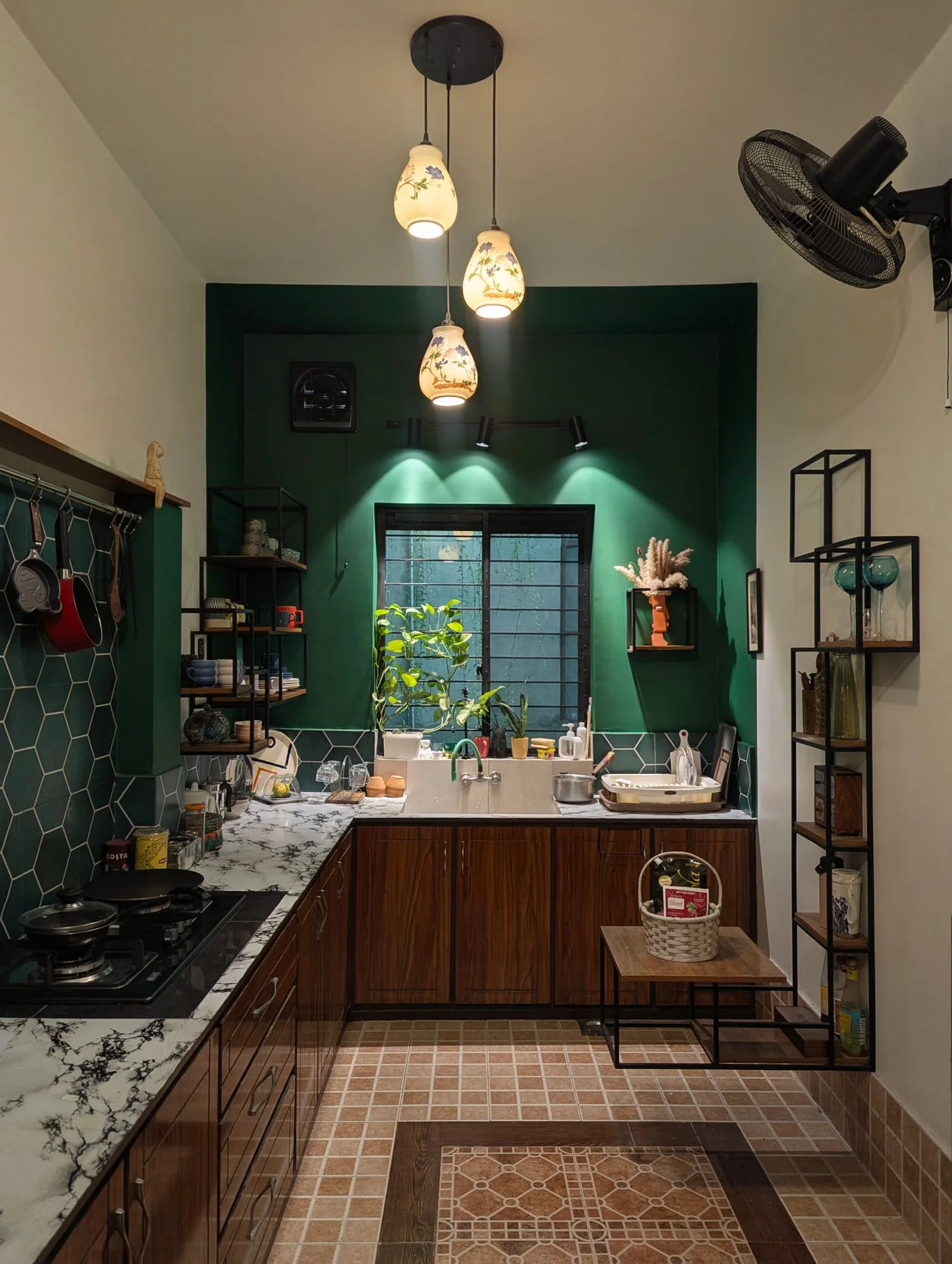
Observe the room before choosing a new finish
A dark kitchen wall can be visually appealing while reading differently across the room's ordinary light conditions. Before changing it or adding another dark element, observe the retained wall with the actual cabinets, counter and lighting in use. The useful comparison belongs to the kitchen's real day, not only its brightest photograph.
This is a visual planning guide, not a technical lighting or paint specification. Follow product, appliance and installation requirements and obtain appropriate advice where needed. A dark green kitchen image does not establish suitability for every surface or room.
Look at the tasks performed nearby
Notice where preparation, reading a recipe or another actual kitchen task happens. A wall color can be enjoyed while task suitability still needs a separate check. Do not assume a dramatic room image establishes that the working area has appropriate light for every user.
Our worktop zone guide starts with the real jobs. Keep those tasks central when judging the wall, rather than treating its appearance from the dining area as the only relevant viewpoint.
Compare the retained lighter surfaces
Look at how cabinets, counters and other suitable retained elements relate to the wall. A pale surface may provide a clear visual contrast without every accessory needing another bright color. Decide which relationship is personally enjoyable through actual observation.
The pantry storage guide keeps the real ingredient and container roles clear. Open storage can form part of the wall view, but its practical requirements should not be sacrificed to create a perfectly coordinated dark backdrop.
Keep lighting changes through reliable requirements
If a lighting question arises, identify it specifically and consult appropriate product information or qualified advice. Do not assume adding a decorative lamp or changing a bulb by appearance is a complete answer. The visual preference should remain separate from technical suitability. Keep the specific task and actual product identity in the enquiry, so the answer addresses the real preparation position instead of an assumed general preference for a brighter-looking room.
Where a suitable finish sample is being compared, follow the product's guidance and keep its identity clear. A small sample can inform the decision without guaranteeing the exact whole-room result. Observe it beside retained elements rather than only against a neutral sheet.
Choose a modest appropriate next step
After the comparison, decide whether the retained wall works, whether another suitable surface needs attention or whether the question remains unresolved. A room does not need a new color simply because it appears different in morning and evening light.
What if the dark wall is already enjoyed? Keep it and avoid adding unnecessary matching objects. What if a task area needs improvement? Address that actual requirement rather than blaming the whole palette automatically. A considered kitchen color choice joins reliable practical information with an honest view of the light already available in ordinary use.
Compare current options
Use the measurements and buying checklist above before choosing. These links go to current retailer ranges; prices, stock and delivery terms can change. We do not earn commission from these links.