Make a Paper Colour Map for the Wall Above the Sofa
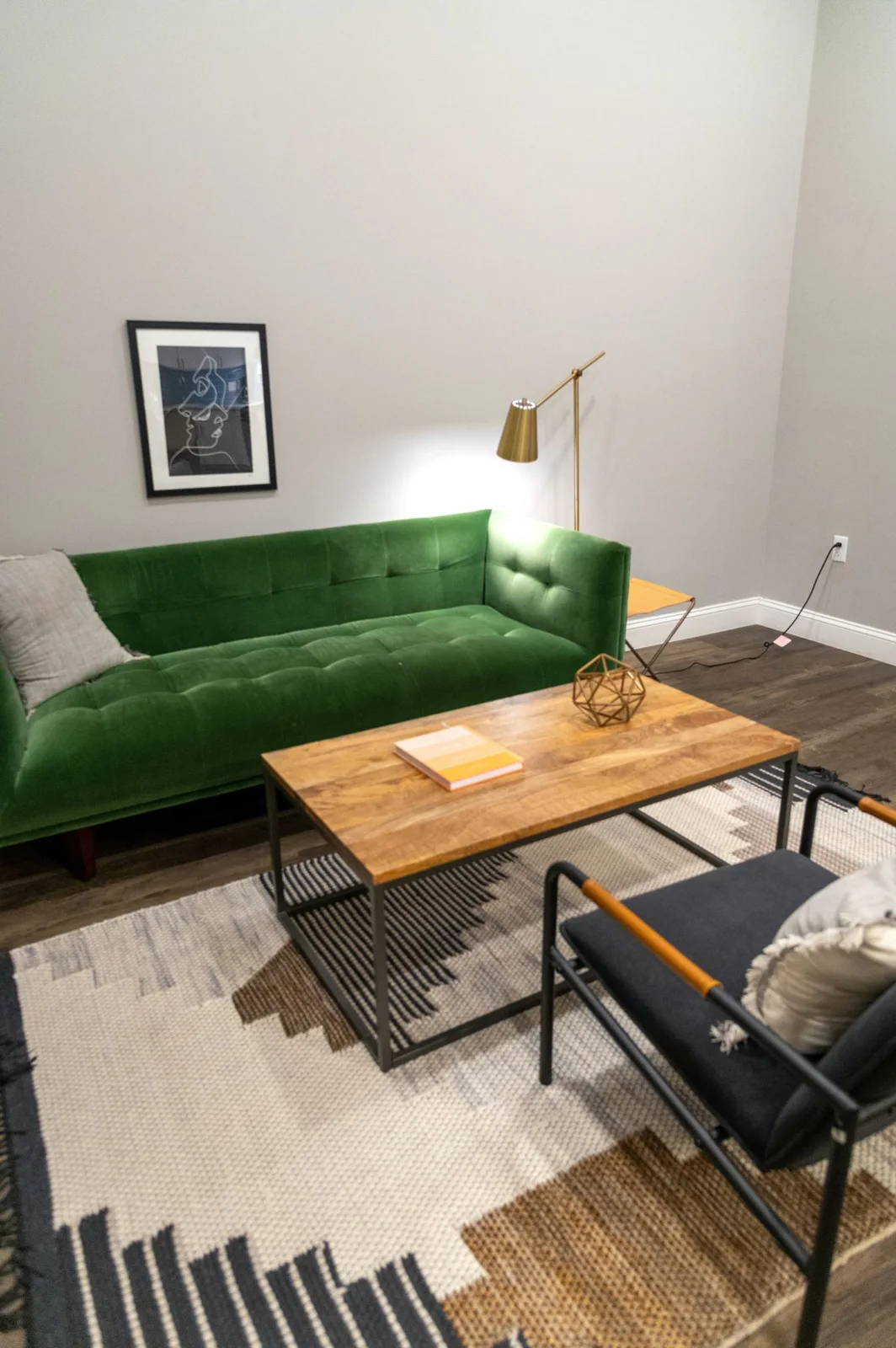
Name the retained objects first
A paper colour map can clarify the area above a sofa without becoming a complete room redesign. Begin with the actual wall, retained seating and artwork that will stay. Write their ordinary descriptions before selecting new colours from unrelated inspiration images.
The map is a personal visual aid rather than a product specification or installation plan. Keep material identity, product requirements and any fixing questions tied to accurate information and appropriate help where needed.
Use paper for relationships, not exact colour
Choose suitable retained paper or simple written colour labels to represent the modest group. A paper swatch can stand for a broad relationship while still differing from the actual textile or wall. Keep that limitation clear rather than treating the collage as exact evidence of a product match.
Name each piece beside the colour reference. A label such as sofa fabric preserves context better than an anonymous pale rectangle that later becomes confused with the curtain or another retained object.
Keep the wall group bounded
Include the artwork or objects genuinely relevant to the intended wall view. Do not add every decorative possession simply because the paper has space. A smaller group can make the actual unresolved relationship easier to see.
If one part feels disconnected, describe whether the question concerns tone, shape or another specific detail. Replacing a colour reference will not answer an unclear frame-scale question, and a new picture may be unnecessary if another optional textile is the competing element.
Compare one suitable alternative
Keep the retained references steady while trying a modest proposed change on the paper map. The exercise can reveal what question needs a real sample, but it should not authorize a purchase or alteration by itself. Use accurate product information for any actual option that proceeds.
Try removing an optional piece as well as adding one. The wall may become clearer through a smaller retained group, leaving no genuine need for another object. A gap is not automatically evidence that decoration is missing.
Return to the actual room
Look at the real ordinary view and check which relationship the map helped explain. A paper arrangement can oversimplify material, light and scale, so keep the final decision connected to the actual setting. A private reference image may preserve context without replacing the local comparison.
What if the map suggests several possibilities? Choose the specific question that matters next instead of buying all the proposed colours. What if the retained group already feels coherent? Keep that useful result. A considered sofa-wall map supports one bounded decorative conversation while leaving the real room and person's preference central.
Store the current map with its relevant references only while it has a real role. An obsolete collage should not remain an assumed shopping list after the room plan changes.
Related reading
Picture Displays for a Home You Rent, Separate Home Project Ideas From the Project Underway.
Compare current options
Use the measurements and buying checklist above before choosing. These links go to current retailer ranges; prices, stock and delivery terms can change. We do not earn commission from these links.