Describe a Room Palette Before Shopping for Decoration
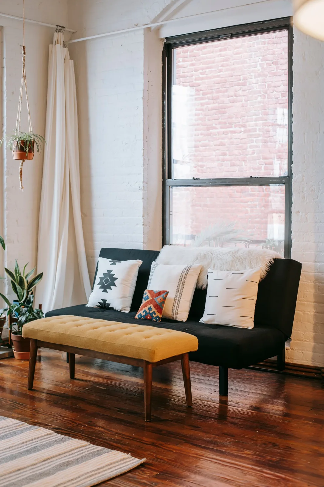
Begin with what actually stays
A room palette is easier to discuss when it starts with retained objects rather than a list of fashionable colour names. Look at the actual living room and name the prominent wall, upholstery, curtain and other surfaces that will remain. Keep the group modest enough to describe the real room rather than every small object owned.
The list is a personal reference, not a claim that a photograph reproduces exact colour. Use the actual local view where subtle differences matter.
Use concrete ordinary descriptions
Write the colour beside the specific object it describes. A note about the actual sofa is more useful than a broad label such as warm neutral. If a tone is uncertain, preserve that observation rather than pretending a general name identifies a verified product colour.
Separate material identity from appearance. A timber-looking surface or textured fabric should not acquire an assumed composition from the palette note. Product requirements and accurate specifications still belong with their real sources.
Name the actual visual question
Decide what remains unresolved: an optional detail feels disconnected, several tones appear too similar to your preference or the room already has enough colour and another purchase may be unnecessary. Those are different questions and should not all become an instruction to add an accent.
Keep the choice personal. A quiet palette can remain deliberate, while another person may prefer more visible contrast. There is no requirement for every room to contain the same number of repeated tones.
Compare one suitable retained detail
Before browsing, try an appropriate object already owned where it has a genuine role. Keep the surrounding room steady so the change is understandable. Replacing the cushion group, rug and artwork together can make it difficult to identify which relationship actually helped.
If a sample or proposed product is considered, preserve its exact reference. A broad colour word may describe several different tones and constructions. A private comparison photograph can keep context, but the real local group remains important where the difference is subtle.
Turn the list into a bounded decision
Write one plain sentence describing the proposed change and its actual role. If the sentence merely says buy more decoration, revisit the original question. A specific unmet relationship gives a purchase a clearer purpose than a list of colours that supposedly need filling.
What if the retained room already feels coherent? Keep that useful result without creating a new requirement. What if a word describes several different surfaces poorly? Split the reference into the actual objects rather than forcing them into one category. A considered colour-word list makes one decorative conversation clearer while leaving the existing room and person's preference central.
Related reading
Separate Home Project Ideas From the Project Underway, Let a Purple Chair Be the One Retained Accent.